LIFESTYLE
Some Tips for Choosing a Background for Portrait Photography
Even though the background plays more of a supporting role, it significantly affects the final result. The best backdrops work in tandem with your subject, allowing them to be bright for bolder occasions or remain understated when style demands it. To make sure your backdrop fits perfectly with the mood of your shoot, let’s take a look at some options. We have gathered here for you the best tips that are equally useful for beginners and professionals. By the way, if you don’t know what ISO means in photography, read the article on Skylum’s blog.
Different colors have hues that can change the mood of portraits, especially depending on the color of your subject’s hair, eyes, clothing, etc. By understanding how colors can affect your portraits, you can better control the mood of your photos. Choose the best combination of texture and background shade. Match the color to the lighting and mood of the shoot, and also consider the model’s closet.
Consistency with your goals
The most important factor in choosing a background color is the purpose of the picture. For example, for business photos, you should use a neutral, standard background color such as white, black, gray, or brown. The right background can add personality and uniqueness to your photo shoot.
Consider the material and color of the background
If you are planning to use a traditional photo backdrop, you should familiarize yourself with several options. As you can imagine, photo backgrounds vary in size, color, quality, and cost, so there is a lot to consider. However, for this article, we’ll look at the choice of background materials depending on their impact on the color and purpose of your shoot. Here’s a quick overview of some of the options available.
Seamless paper
You’ve probably seen rolls of seamless paper used in fashion portraits and product shoots. They are relatively easy to use and provide a portable alternative to walls. Seamless paper allows photographers to create a clean image with smooth transitions, directing the focus to the subject. Although black, white, and gray are the most popular colors, you can choose from dozens of colors to suit your purposes. The best part is that if the paper gets scuffed, you can easily roll out a few more sheets and cut off the unwanted part.
Vinyl
For photographers looking for a sturdy, flat background with a matte surface that doesn’t reflect light, vinyl may be a better option. It’s important to remember that, unlike seamless paper, vinyl has more weight, so it’s harder to move and hang in different places. However, for studio environments, vinyl is ideal, especially for business portraits.
Hand-painted canvas
Some photographers regularly use hand-painted canvases to create portrait backgrounds. Having several layers of paint applied to them creates a rich texture, and they provide an elegant atmosphere in which to show the subject. The cost of hand-painted canvases varies, although they are usually expensive, the results can justify the cost.
Match the background color to the lighting and mood
As we mentioned above, color greatly affects the mood of a photograph. The same is true for lighting. Remember what you need to know what is ISO in photography and make the right settings. It makes a big difference in exposure and the result. Don’t forget to use a photo editor if you need to correct some of the nuances of the photo. Now there are many easier alternatives to Photoshop with an intuitive interface and AI tools. For example, Luminar Neo is a great solution.
How do the backdrop colors affect the portrait?
Here’s a quick overview of some color options and how you can use them to match lighting and mood in portraits. These tips apply to the dominant color backgrounds you’ll find in the photo studio as well and are not limited to hanging backgrounds:
- White is the most popular color. It is clean and distraction-free and is perfect for bright, light, and airy photos. White backgrounds go well with any clothing, and the neutral color can change depending on the lighting.
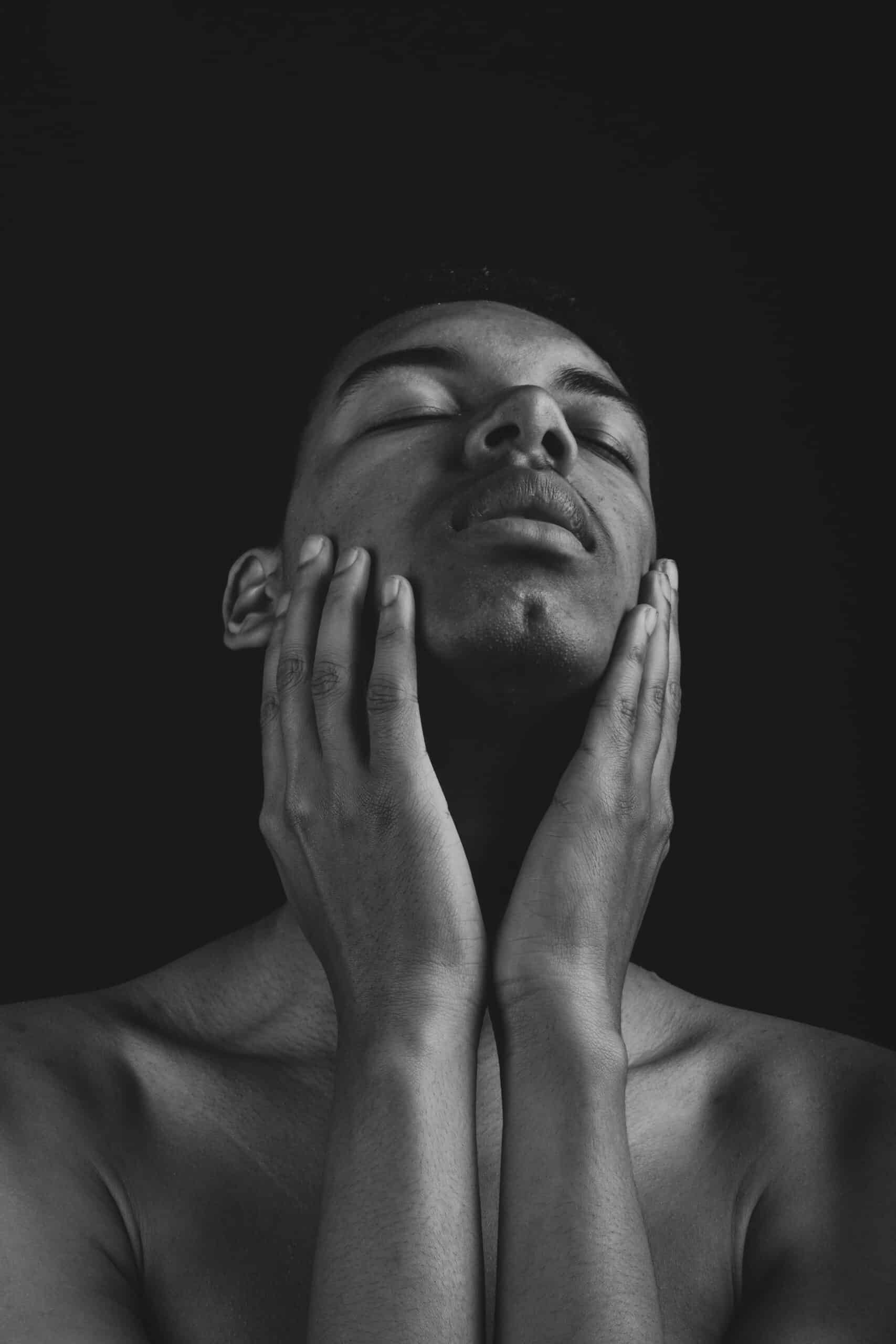
- Black backgrounds are ideal for austere, professional portraits. Depending on the lighting, they can add elegance to photos as well as a touch of mystery. This classic background color serves as a neutral solution that will always allow being the center of attention.
- A neutral, gray background will draw attention specifically to your model, minimizing the number of distractions. Photographers often resort to gray when shooting fashion portraits and product shots.
- Perhaps more than the other colors on this list, red requires attention. Red is often associated with love, energy, and passion, and is even used in fast-food establishments to evoke feelings of hunger. On the other hand, red can also be associated with aggression. It is by far one of the boldest choices on this list and should be used rarely and always with intention.
- We often associate green with the Earth and nature. Different shades of green can have a soothing effect when used as a backdrop. Darker shades of green, however, have other connotations, such as respectability and the desire for wealth.
In the latter case, the use of a spectacular on-camera flash and low exposure can greatly enhance a portrait. If you don’t fully understand what ISO means here, then figure it out beforehand.

Consider the combination of your closet and background color
Whichever combination you choose, you need to consider color theory and be aware of the effect your choice of closet color in contrast to the background color will have on your image.
We hope these tips on how to choose the right background color have been helpful to you. Because of the variety of options available, from colors and textures to backdrop materials, choosing the best option can sometimes seem difficult. We also suggest exploring what ISO means in photography in an article on the official Skylum website.